This use case shows how to perform a functional analysis of pancreatic cancer expression data with Blast2GO. The performed steps are explained more in detail with short video tutorial linked to each section.
Malignant (PDAC), benign (CP) and normal tissue (NP) gene lists are compared against each other. The human genome functional annotation data is retrieved via BioMart and used as the reference. The data set is analysed using two different enrichment-analysis strategies, a Fisher’s Exact Test and GSEA and results are visualized in various different ways within Blast2GO.
Analysis Workflow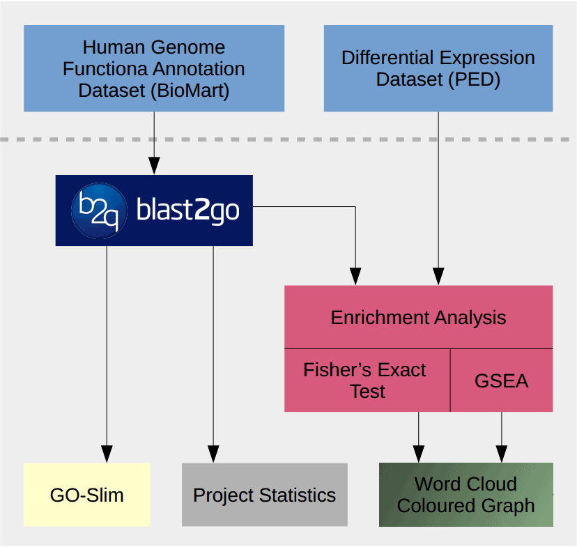
- Extract and Review data with Blast2GO.
- Load the complete human genome GO annotation by BioMart.
- Make several Project Statistics to check coverage of annotated sequences.
- Reduce the functional information with GO-Slim.
- Import differential expressed gene list.
- Import two datasets from Pancreatic expression Database: Pancreatic Ductal Adenocarcinoma (PDAC) vs Normal Pancreas (NP) and Chronic Pancreatitis (CP) vs Normal Pancreas (NP).
- Methods to visualize functional profiles.
- Word Cloud
- Coloured Graph
1. Extract and Review functional information
First, we will obtain the complete functional annotation (GO terms) of the human genome via the BioMart import function in Blast2GO. This will be our reference set for the functional analysis. BioMart provides free software and data services in order to foster collaboration and facilitate the scientific discovery process. Once we open the BioMart wizard in Blast2GO we have to introduce the parameters of the download. In our case, we select human, the type of ID (we choose Ensemble Gene IDs and UniProt), the sequence type “Proteins” and “Whole Genome” to download all available entries.
The download may take several minutes (or hours) depending on the type of IDs and the workload of the servers. For us, Ensembl took less than an hour while the UUniProtIDs took around 12h.
Once results are obtained for both, Ensembl IDs and UniProt IDs we will compare them with B2G. A Pie Chart of the data distribution is created to observe the distribution of annotated and non-annotated sequences.
Ensembl and Uniprot Dataset 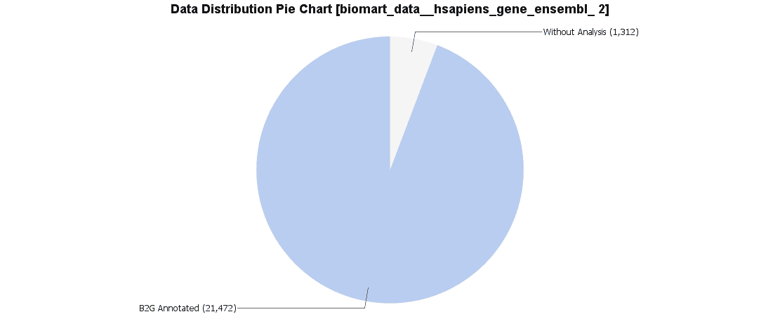
We downloaded both data sets via BioMart. For Ensemble we obtained 21472 sequences with annotation and 1312 sequences without annotation. Uniprot was 24054 annotated sequences and only 663 sequences without annotation.
Due to this difference we looked for repeated sequences using the Blast2GO feature “Find duplicate sequences” and found several hundred identical sequences in the Uniprot data set. We finally decided to continue with the Ensemble IDs since these are the IDs used in the differential expression study used later on.
GO-Slim
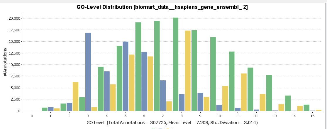
GO-Slim is used to obtain a more general view of the function information of the Ensembl dataset. GO-Slim is a cut-down version of the Gene Ontology (GO) containing a subset of terms in the whole GO. It gives a broad overview of the ontology content without the details of the specific, fine-grained terms. We have to choose the corresponding GO-Slim subset, according to the data and organism we are working on. In our case, Generic GO-Slim is chosen because there is no specific human subset. Once applied, the sequence table turns from blue to yellow. To evaluate the reduction, we can compare the GO-level distribution with and without GO-Slim and observe the GO-level differences.
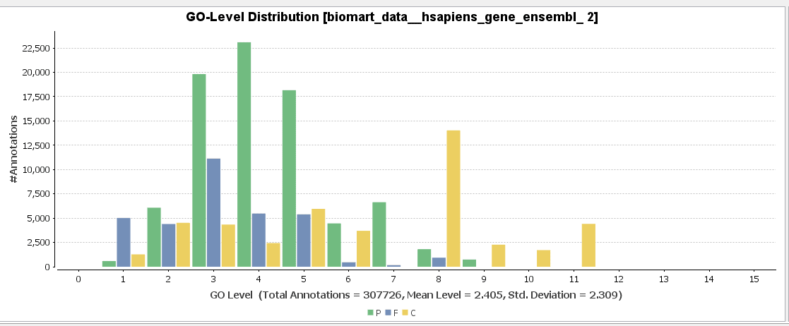
For a better visualization of GO-Slim annotations, we do a combined graph of molecular functions for the annotations with and without GO-Slim.
If we would continue working with the GO-Slim data, we would only obtain very general information about our differential expressed genes. For that reason, GO-Slim annotation is removed/undone since we want to use the full potential of specific functions.
Video Tutorial Step 1![]()
BioMart and GO-Slim
2. Differential expressed genes
The data used in this study has been obtained from the Pancreatic Expression Database: “Microarray-based identification of differential expressed growth- and metastasis-associated genes in pancreatic cancer” by Friess H. et al.
The aim of this study was to identify the key mechanism of deregulated molecular functions in different types of pancreatic cancer to improve the diagnosis and treatment of PDAC and the understanding of the molecular mechanisms underlying pancreatic malignant growth.
The study contains a comparison between Pancreatic Ductal Adenocarcinoma (PDAC) versus Normal Pancreas (NP) and Chronic Pancreatitis (CP) versus Normal Pancreas (NP).
The Ensambl IDs of over- and under-expressed genes for the different cancer cell types were exported into a plain text document.
3. Enrichment Analysis
We will apply to different enrichment analysis: Fisher’s Exact Test and a Gene Set Enrichment Analysis (GSEA by MIT/Broad)
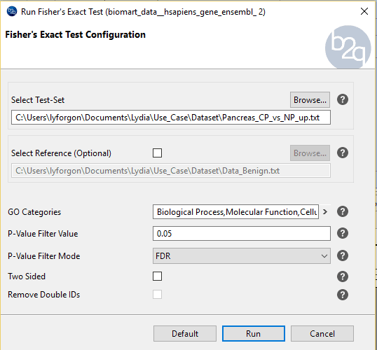
3.1 Fisher’s Exact Test
The Fisher’s Exact Test is a statically test used to discover if certain functions/labels are significantly over-represented among a list of genes when compared against another list. In our case, carcinogenic cells and normal cells are going to be compared, showing us which functions are more present in the first condition, based on the number of genes related to a given function (GO-Term).
To test if a GO-Term is statistically significantly over-represented, its FDR (false discovery rate) value, the p-value after multiple testing correction, has to pass a certain cut-off.
FDR (False Discovery Rate) is the statistical value we focus on to determinate if a certain biological function is being overrepresented in one condition against the other because it controls the expected proportion of incorrectly rejected null hypotheses. FDR is considered instead of a p-value because it is adjusted to multiple testing errors and it is more restrictive and reliable in this scenario.
Procedure to follow:
We will perform the following to comparisons: PDAC vs NP and CP vs NP.
In the next section we will see the parameters available in Blast2GO:
The results of the study show a table with all the enriched functions above the given cut-off.
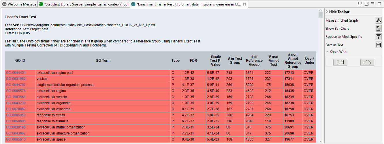
On the right side we can see a toolbar with several options. If we click on “Reduce to most specific”, a similar result table will appear with only the most specific functions. All parent functions which have also a significant child GO-Term will be removed. This can be useful in case of very long lists since functions will be filtered by their specificity any only the most detailed functions will remain.
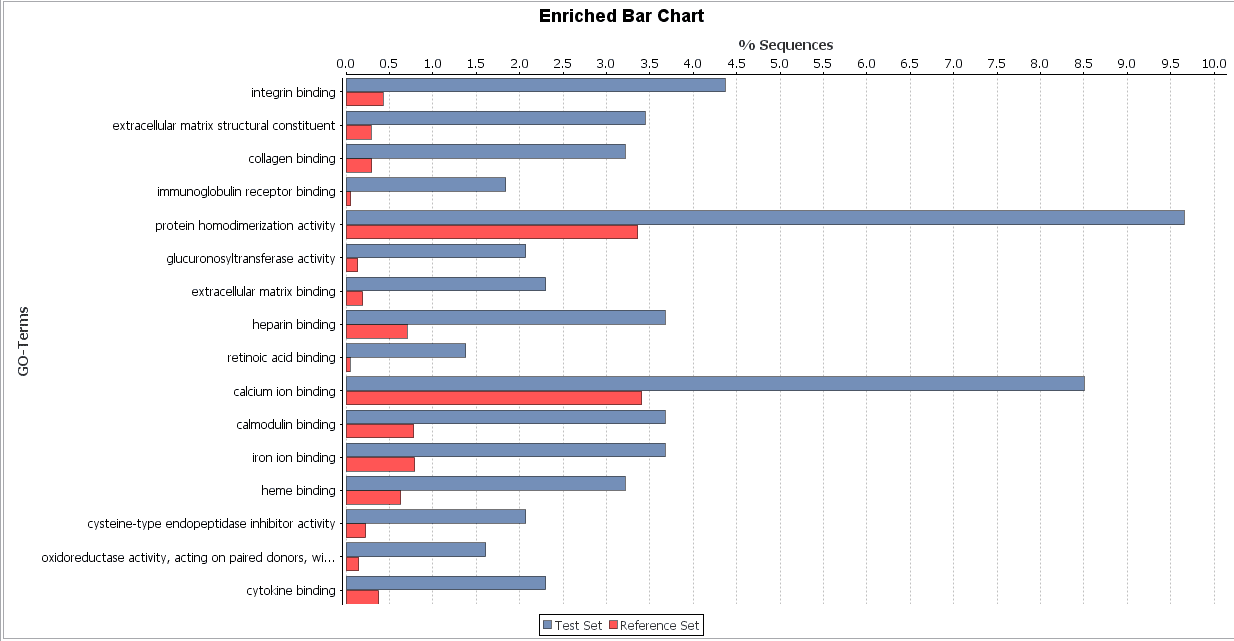
Blast2GO offers several different options to visualize these enrichment results in a very user-friendly way.
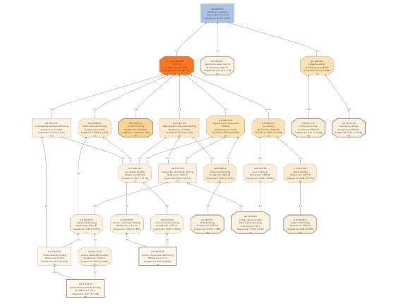
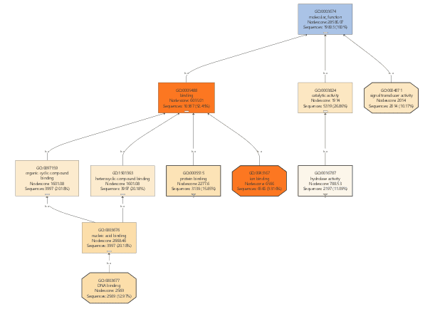
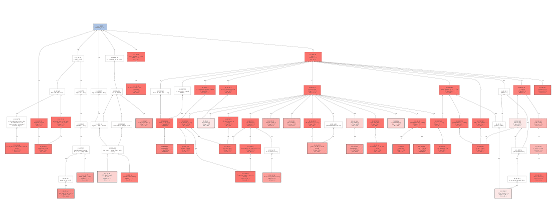
Enriched graph
Bar chart
![]() Video Tutorial Step 3.1
Video Tutorial Step 3.1
Fisher’s Exact Test
3.2 GSEA
The Gene Set Enrichment Analysis (GSEA) is a statistical test to search for enriched functions (gene sets) in a list of ranked genes. The goal is to determine if the member of a gene-set (e.g. a GO function annotated to a number of genes/proteins) tend to occur toward the top (or bottom) of a sorted gene list.
For doing this analysis, we have to create a text file (.rnk) with the Ensembl IDs on the first column and the statistical value (decimal values separated with dots, not commas) in the second one. For this analysis, the fold change of the gene expression values is used to sort the list of gene IDs.
As parameters, we have to provide the ranked list we want to study and other features like the permutation, plots, filter value, etc. Of course, we will have to have a Blast2GO project with our annotated sequences.
For a first run, we recommend the default parameters. Pay attention to the filter values, because 0.25 is the usually the cut off for this type of analysis (instead of 0.05). Here an FDR of 25% indicates that the result is likely to be valid 3 out of 4 times, which is reasonable in finding candidate hypothesis and using a more stringent FDR cut off may lead you to overlook potentially significant results.
GSEA results:
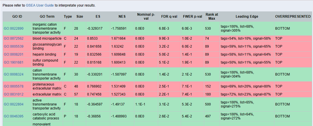
The results which are in green are over-represented at the bottom of the list. That means that those functions are under-represented. Since we are interested in up-regulated functions we will review only TOP results marked in red.
If we click on the GO term of each function, here for example “blood microparticle”, we will obtain the following chart:
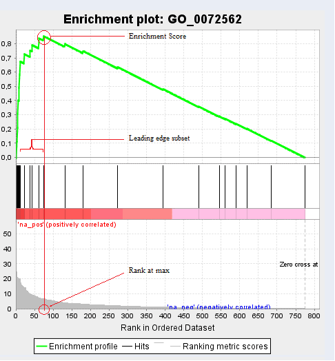
In addition to the previous plot we also obtain the “Random ES Distribution” and other GSEA details like a list of genes that contributed to the given GO ID, their list rank and metric score, the Running ES and the Core Enrichment. From the GSEA side-bar, we can create further graphs which show us the distribution of the data and statistical values.
![]() Video Tutorial Step 3.2
Video Tutorial Step 3.2
GSEA
4. Methods to Visualize Functional Profiles
Blast2GO has several options to visualize list of functional terms.
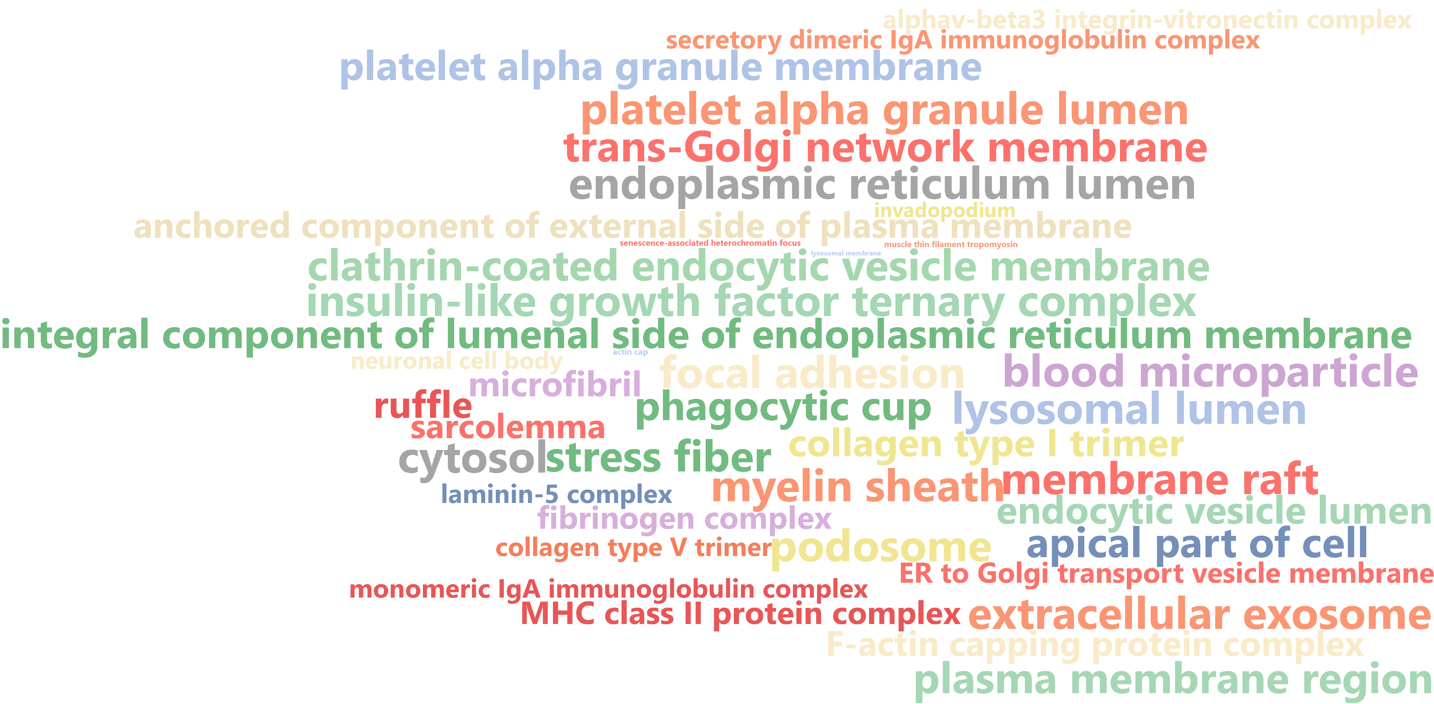
Word Cloud
The “Word Cloud” feature creates a graphical representation of the most important functions shown in different colors and font sizes depending on its importance. This is an easy way to highlight important functions may be suitable for a more informal presentation. There are several options in the toolbar to change the graphical appearance like the number of words, the orientation and the shape of the cloud as well as the color scheme.
Coloured Graph
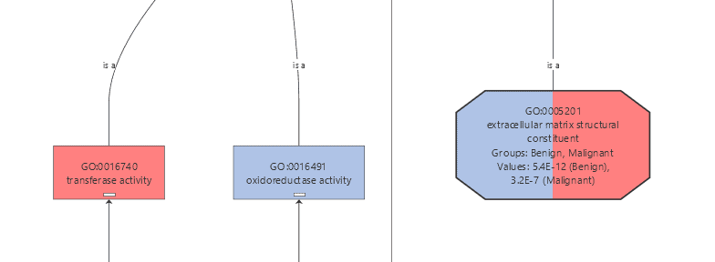
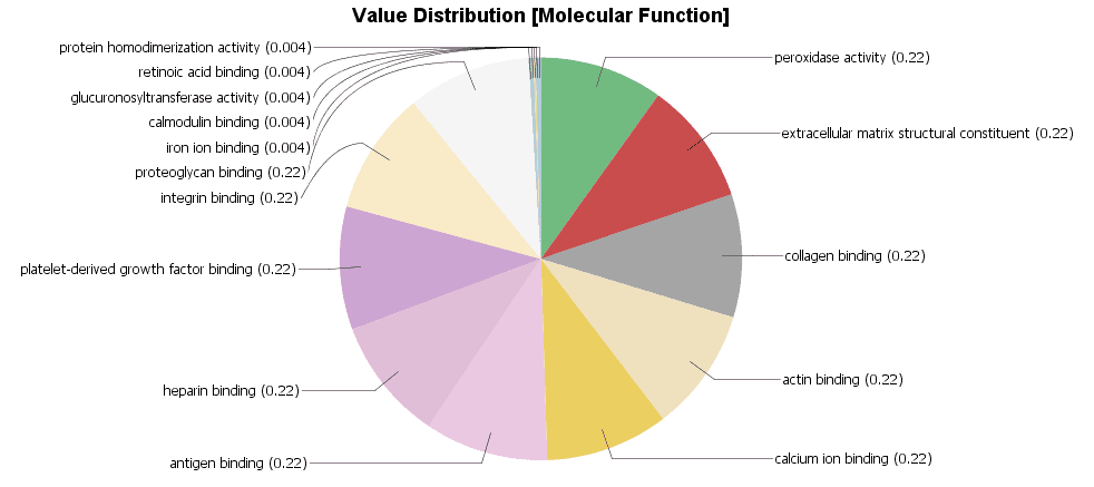
The Colored Graph generates a GO graph from a text file which contains a list of GOs, a group name and numeric value. The text file has to follow a simple structure, to be processed correctly. It has to contain three columns: the first one has to contain a GO ID, the second a number which represents the statistical value and the third column contains the group to which the function belongs. The columns must be separated with a tabulator character. The structure is shown in the following table.
We created a Colored Graph with the Top 10 Molecular Functions for both types of cancer. In the Color Wizard, we choose red for functions of the malignant tissue and blue for benign.
| 1 | 2 | 3 | |
| #GO | Value | Group | |
| 1 | GO:0005178 | 1.0E-10 | Malignant |
| 2 | GO:0005201 | 3.2E-09 | Malignant |
| 3 | GO:0005201 | 5.4E-14 | Benign |
| 4 | GO:0008201 | 2.0E-06 | Benign |
This results in the following visualization.
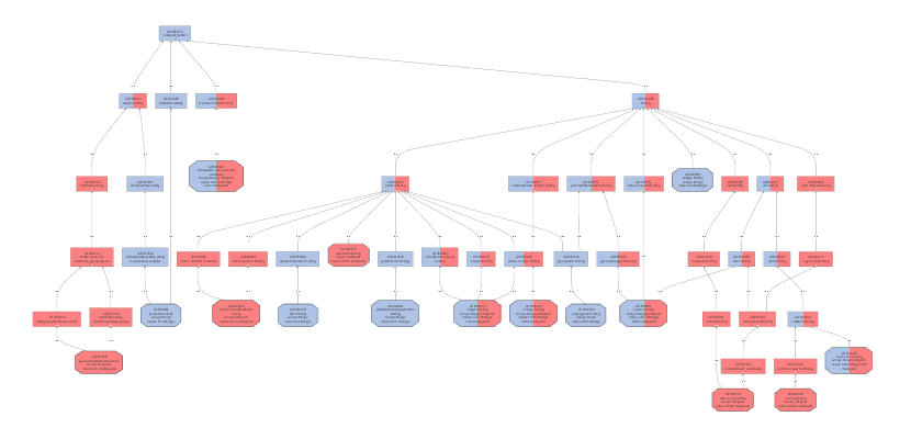
Different charts can also be created from the Colored Graph to visualize results: Level Pie Chart and Bar Chart, and Multilevel Pie Chart and Bar Chart. The levels of the chart mean the specificity of the GO terms, the higher the number, the more specific is the function. The multilevel chart shows that significant functions from the general levels to the specific ones will be shown. For example:
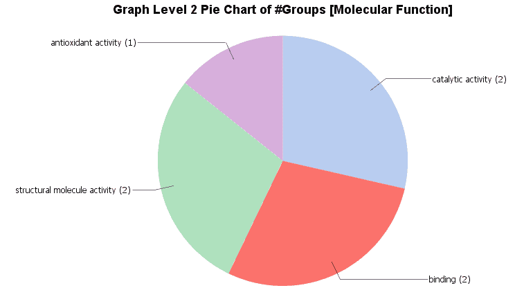
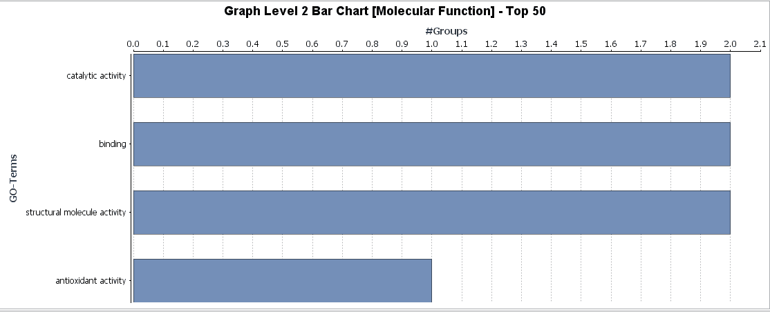
In the Coloured Graph toolbar we have some option to visualize the significant functions for each GO categories and adjust the parameters to change the appearance of the graph. Different summary charts are available.
![]() Video Tutorial Step 4
Video Tutorial Step 4
Coloured Graph
5. Conclusions
In this use-case, we used a public human cancer data set and performed a complete functional analysis within Blast2GO. We obtained differential expressed genes from the Pancreatic Expression Database (PED) and the latest Ensembl Human Genome functional annotation with Blast2GO via BioMart. As a first step, we analysed the functional information via GO-Slim. GO-Slim is useful to obtain a general view of the data and allows to quickly summarize a set of Gene Ontology terms at a more general and uniform way. Once we prepared the ID lists for over- and under-expressed genes in the different tissue and cancer types we performed two different types of enrichment analysis: a Fisher’s Exact Test and a Gene Set Enrichment Analysis (GSEA). The Fisher’s Exact Test (FET) is a very useful statistical test to find significantly over-represented functions in a pairwise comparison (two groups of genes/proteins). GSEA allows identifying enriched functions without defining a test and reference set but by providing a ranked list. For this use case, we ordered our gene list by gene the expression fold-change.
The results of the FET and GSEA analysis are shown below. Enriched functions have been identified comparing cancer vs. normal tissue.
FET: We observe similarities between functions identified for malignant and benign cancer. Comparing both types of cancers, we can observe that malignant cancer has more complex functions, one of the most significant is glucuronidation. This function provides cancerous cells resistance to chemotherapy or other drug treatment because it facilitated the excretion of a certain substance.
GSEA: GSEA showed less enriched functions and we obtained only one significant result when comparing the list ranked by fold-change between genes of malignant and normal tissue. However, when analyzing the ranked list of benign vs. normal tissue we detected 3 over-represented functions. “Blood Microparticle” and “Heparin Binding” with a very low, highly significant (less than 0.05) FDR value and “Proteinaceous extracellular matrix” with an FDR close to the cutoff of 0.25. The latter may potentially be a false positive and should be treated with caution; manual review recommended.
Once we obtained these functional profiles we used several visualization methods to review the results. Especially the Colored Graph offered a good way to compare the functional characteristic of benign and malign cancer tissues.
Note: Most steps performed during this analysis are explained more in detail in the video tutorial linked to each section.
About the author:
Lydia Fortea, Bachelor Student, Biotechnology, Valencia 
I wrote this use-case during my 3 month internship at BioBam. As a biotechnology student at the Polytechnic University of Valencia (UPV) this was a great opportunity to introduce myself into the world of bioinformatics. It was a lot of fun to work with the Blast2GO Team and I had a good time learning and created these video tutorials.
PS: If this tutorial was useful for you please share and/or like it below!